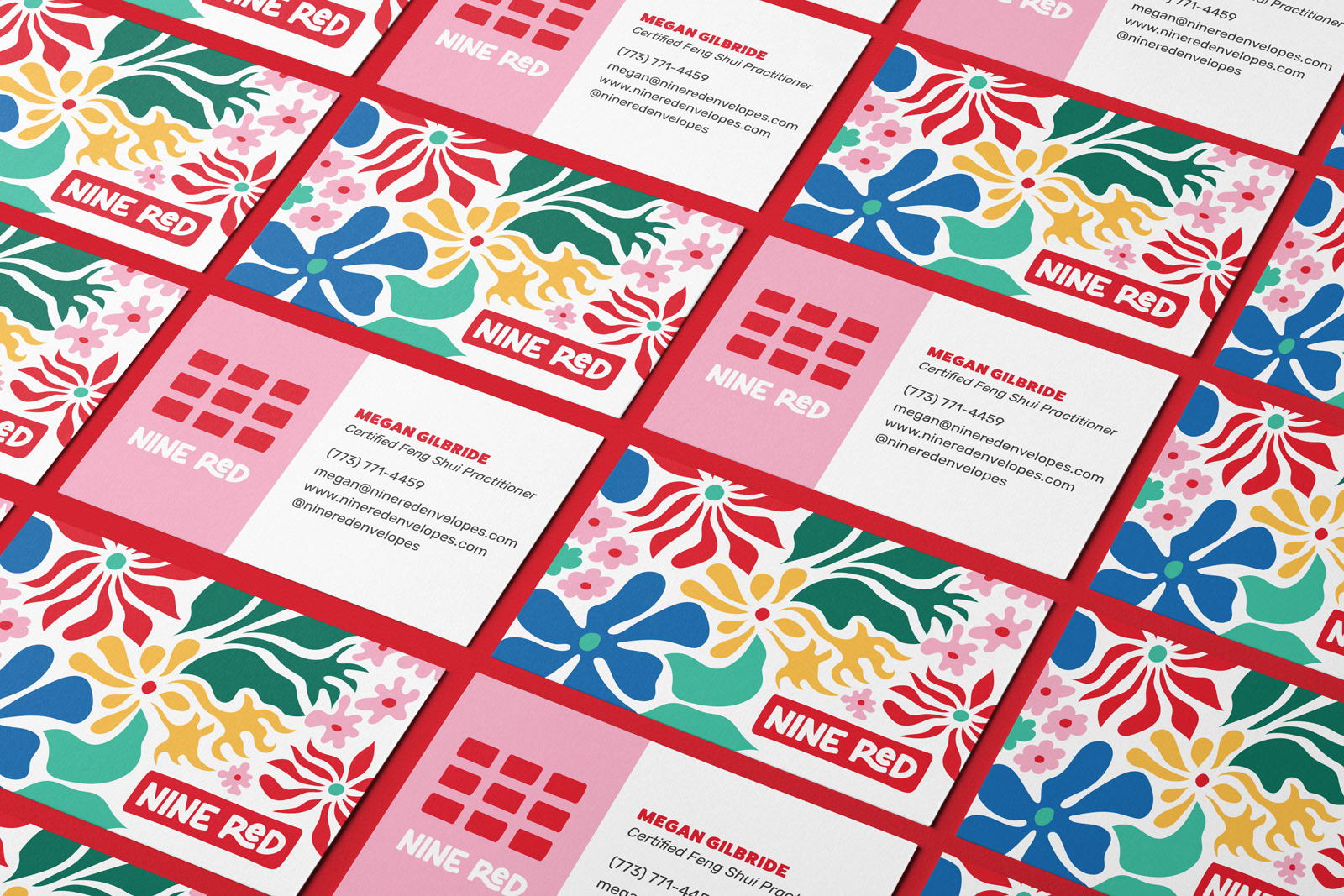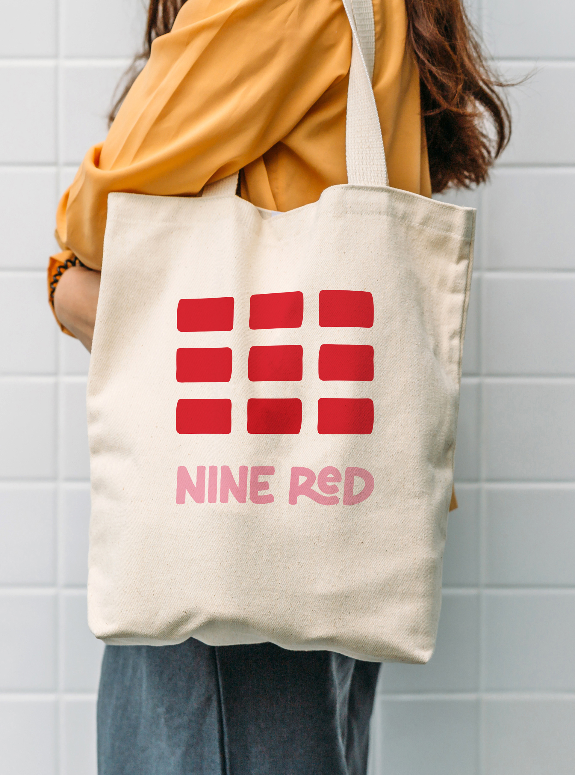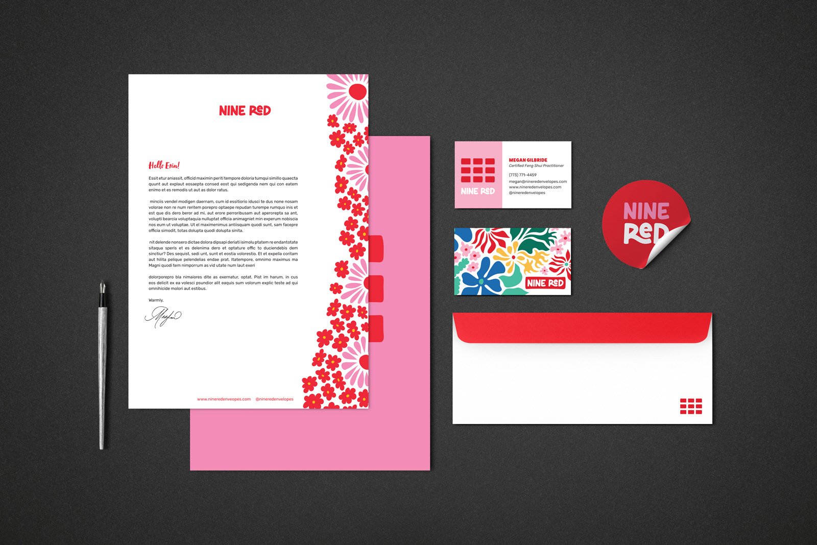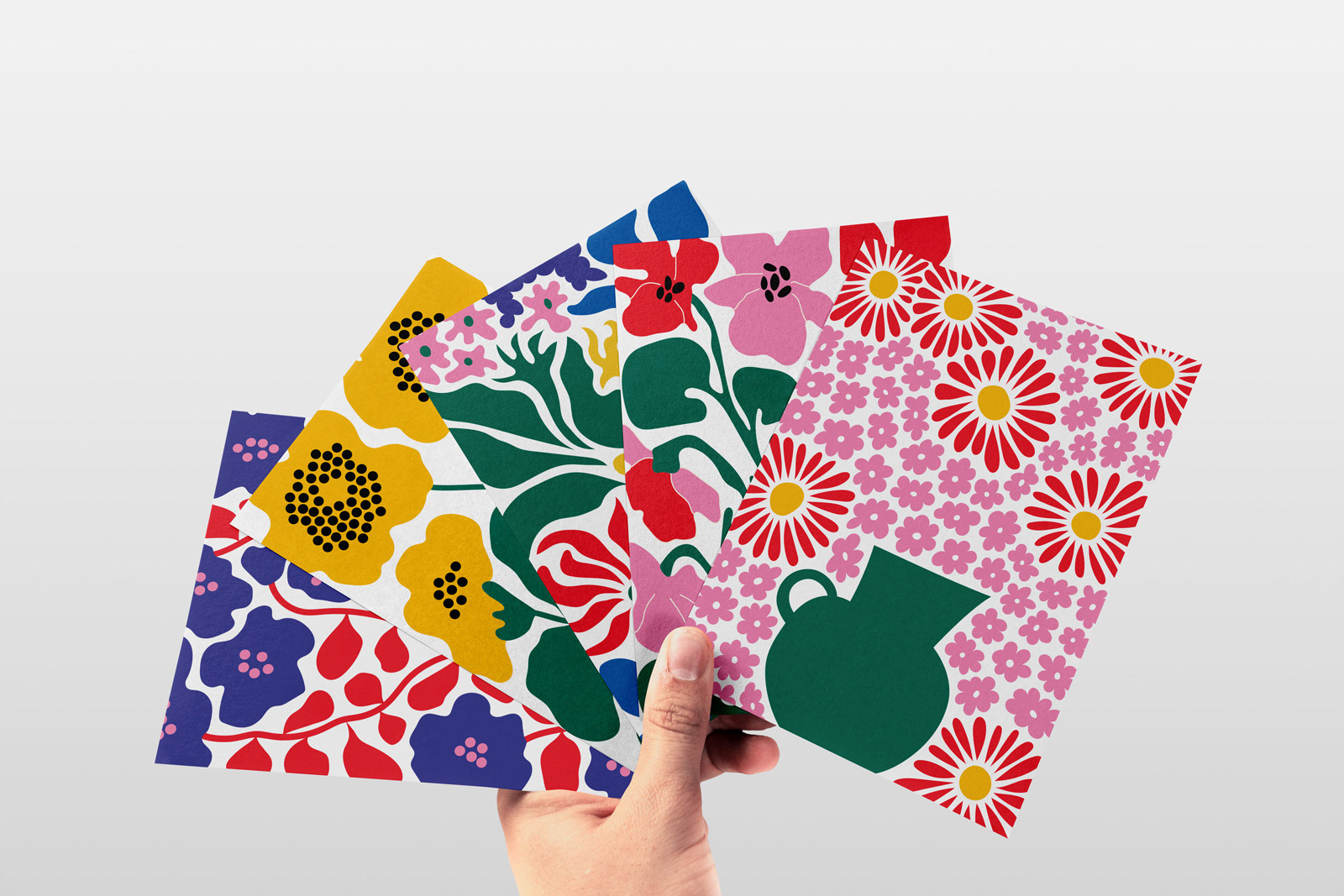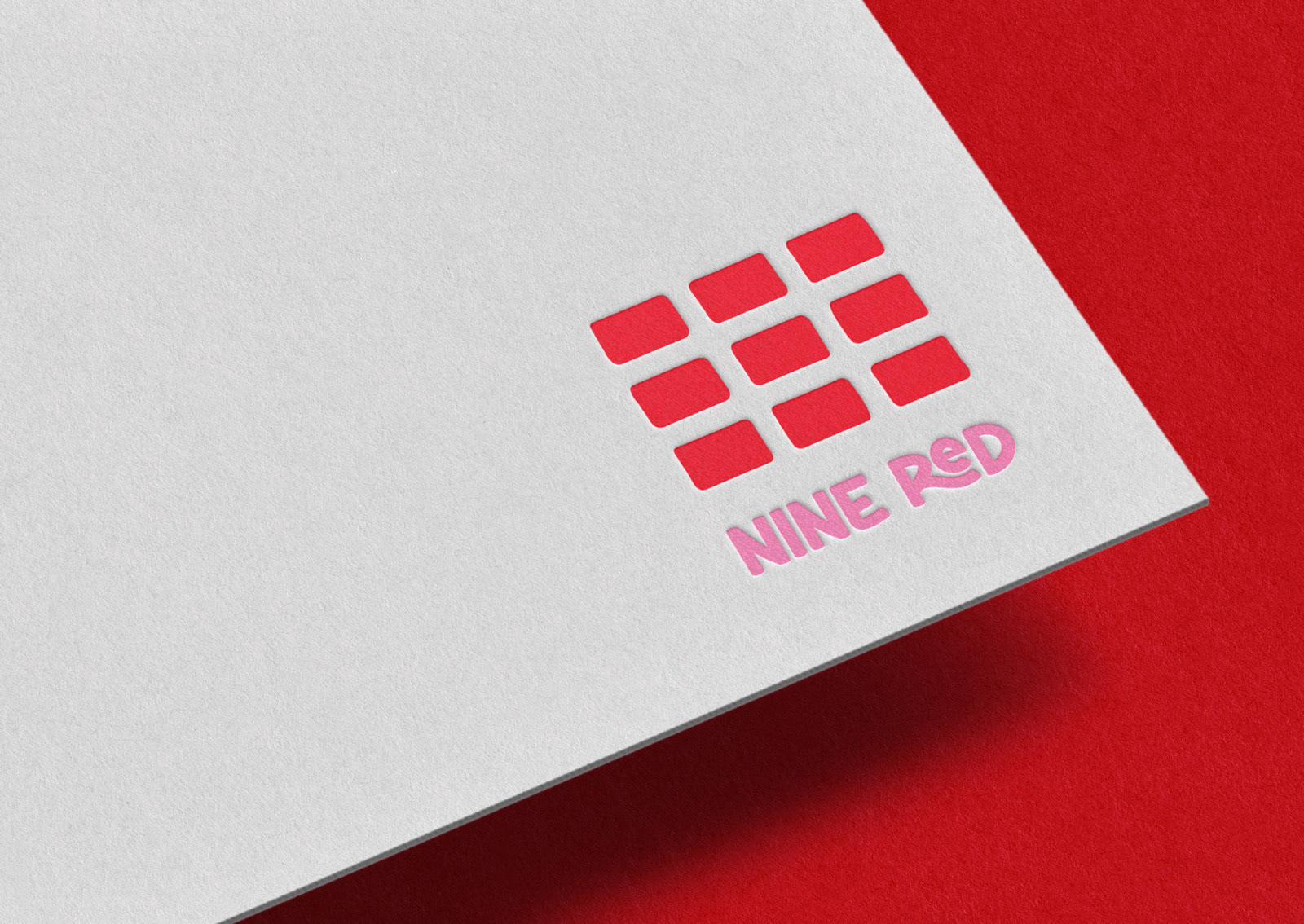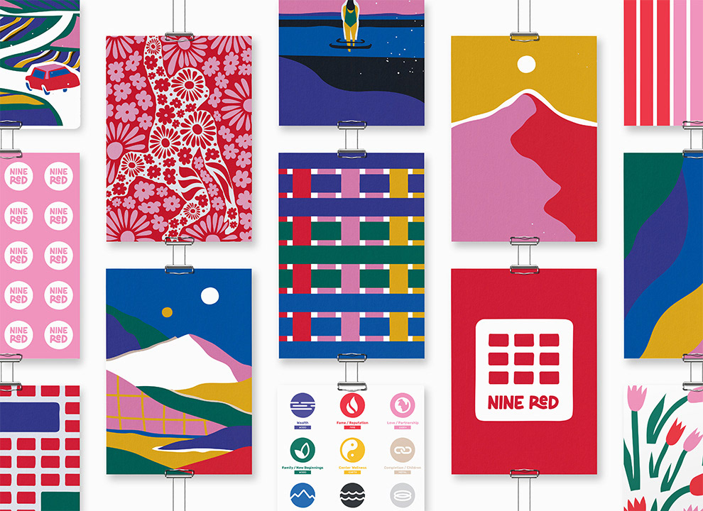
Brand Identity
Collaborating with Nine Red, we embarked on a journey to craft a new brand identity and supporting collateral that honors the timeless principles of Feng Shui while accommodating the unique needs of modern clients. Balancing a playful, feminine aesthetic with a sense of contemporary professionalism was key to the vision. To achieve a playful and feminine aesthetic, we infused hand-drawn elements and naturalistic imagery, evoking feelings of positivity and warmth. Nine Red's brand is further characterized by an extended color palette, carefully chosen to reflect ancient symbolism and industry standards alike.
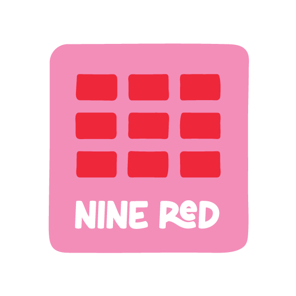
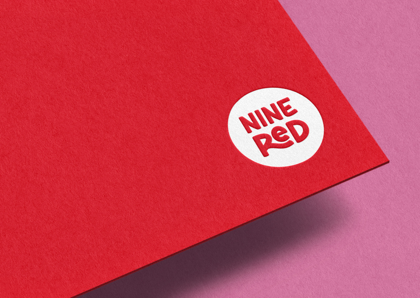
In the sacred tradition of Feng Shui, practitioners are compensated via nine red envelopes as teachings are imparted—a tradition that serves as Nine Red's own "yellow door." This practice symbolizes the exchange of energy, knowledge, and respect, embodying appreciation for traditions and to Megan personally, a profound sense of self-worth. This story, rich in symbolism and significance, became the cornerstone of our design narrative.