Brand Identity | Graphic Design
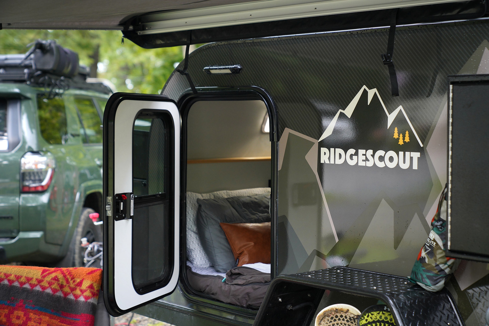
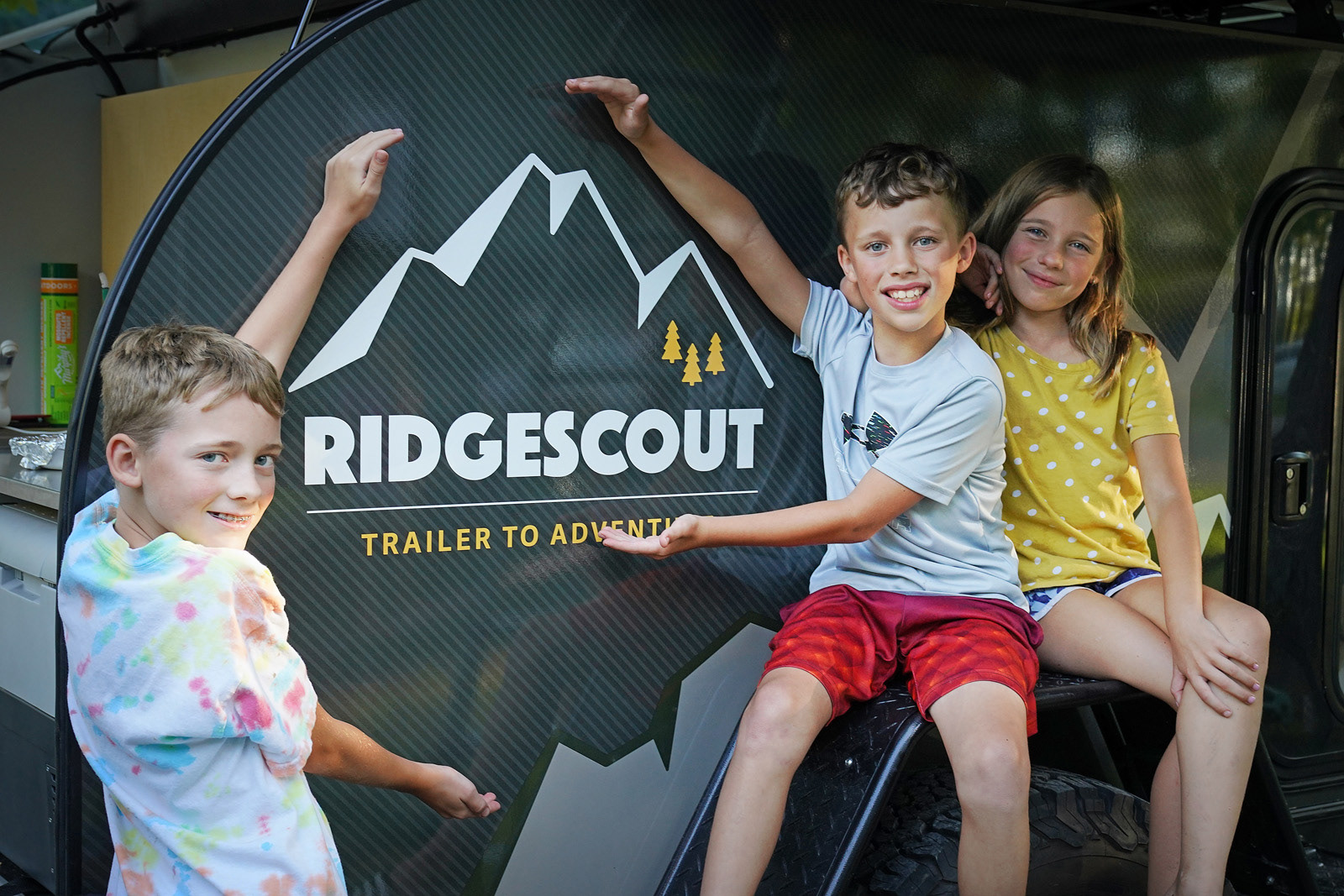
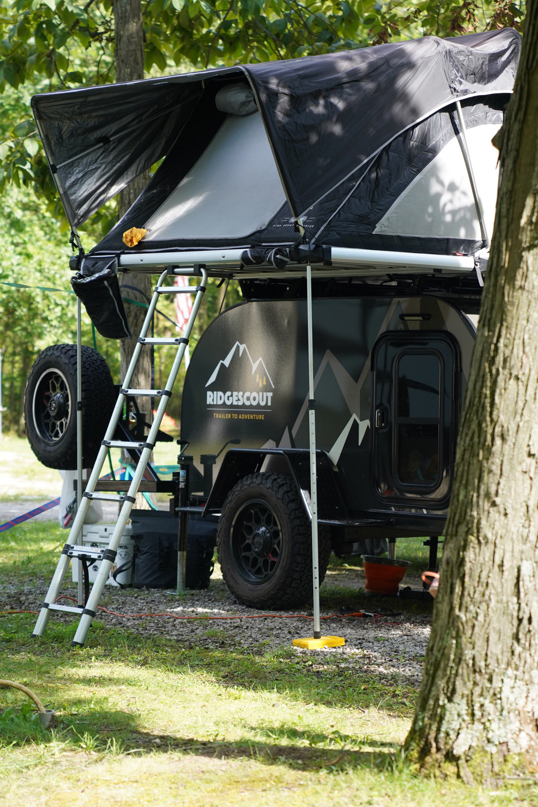
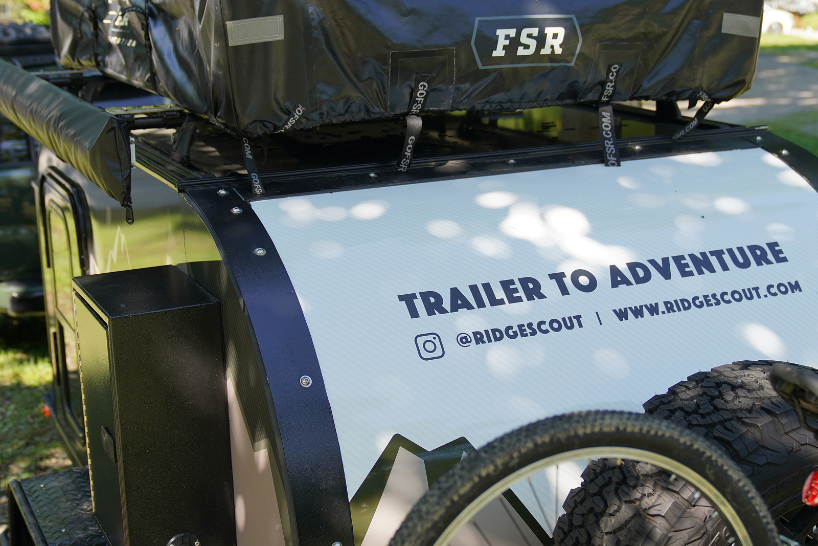
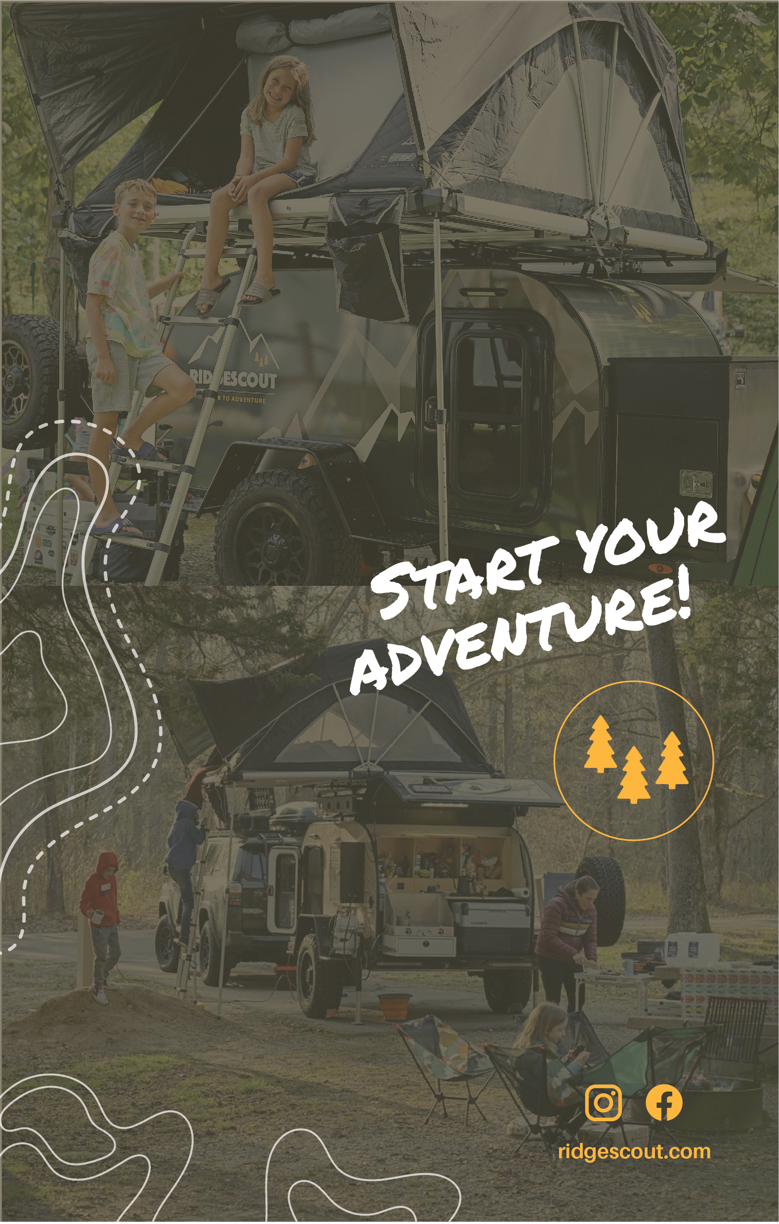
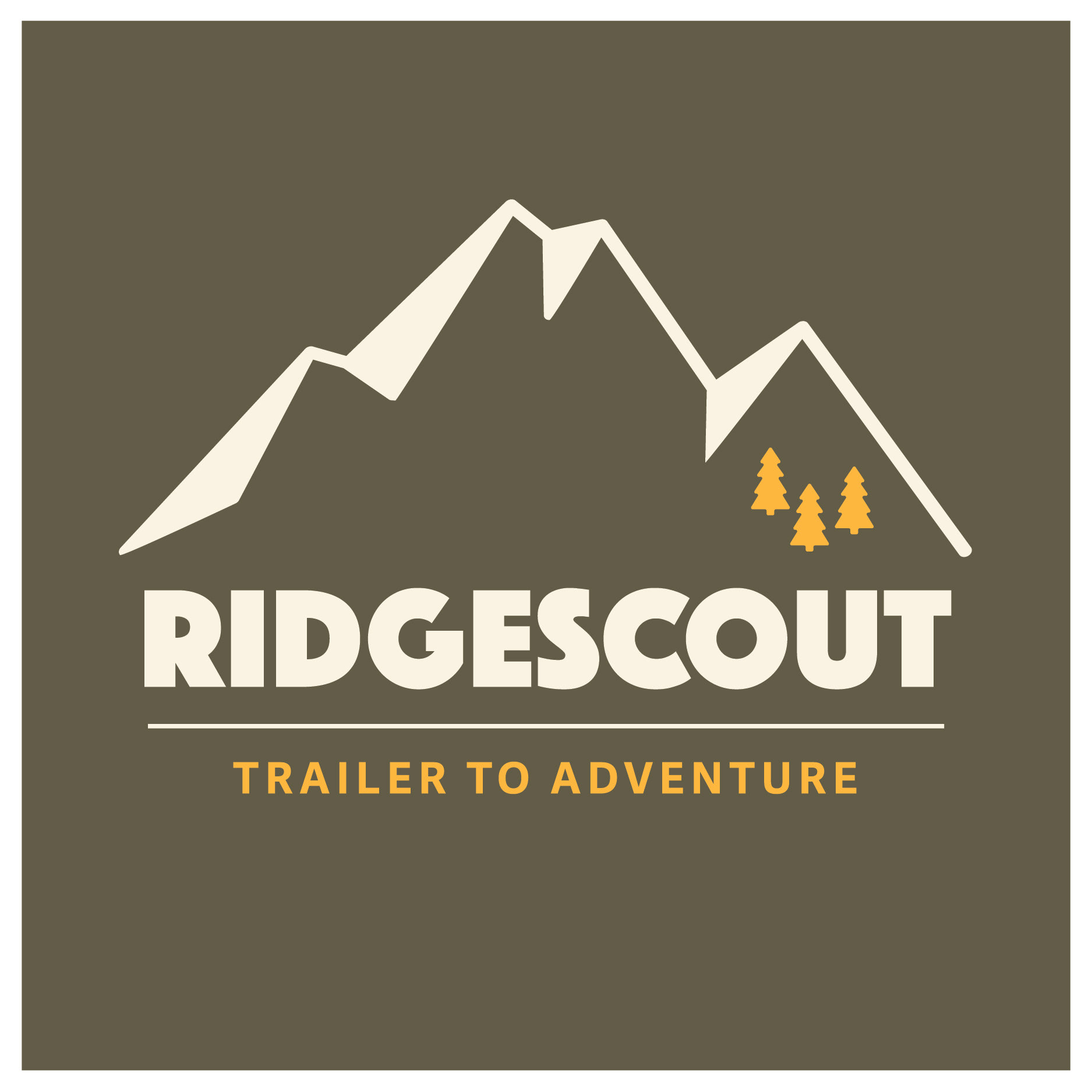
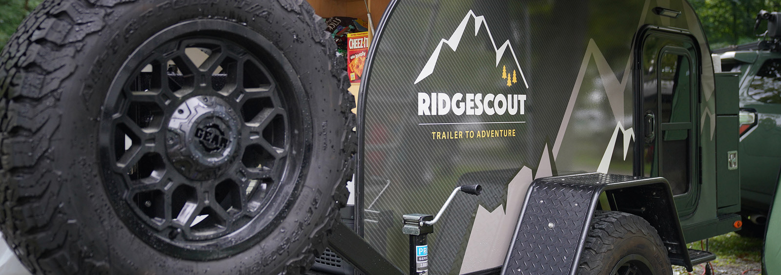
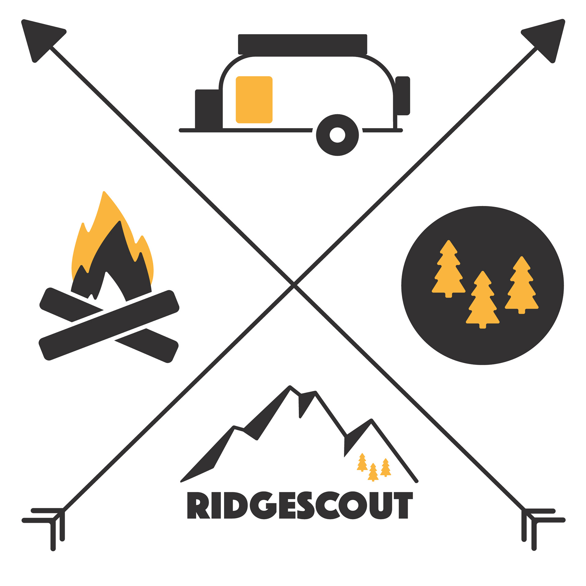
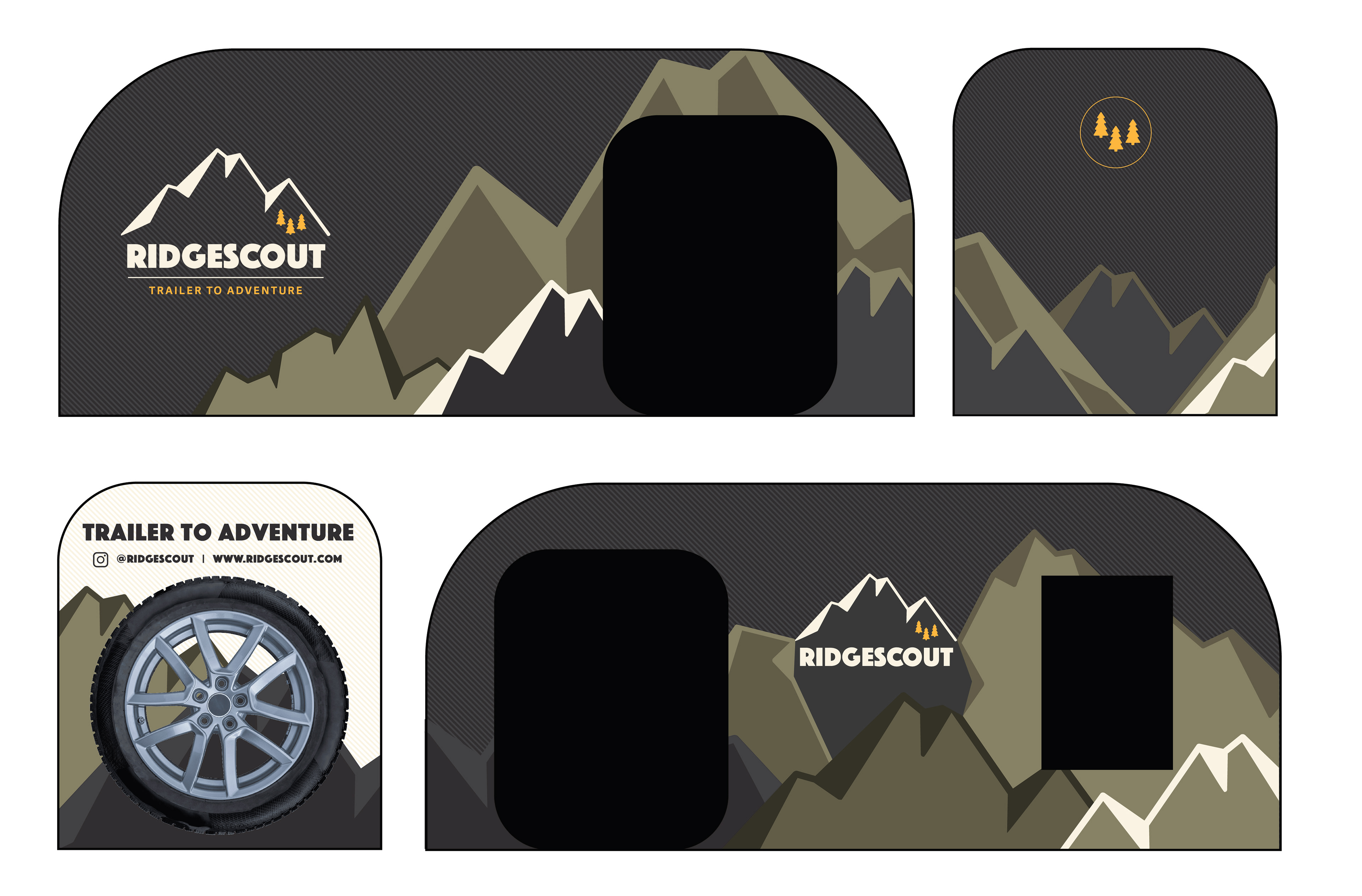
Ridgescout was born from the idea that adventure should be within reach for all and serve as a catalyst for strengthening family bonds. Offering rentable tear-drop trailers, Ridgescout challenges the conventional norms of RV exterior aesthetics, introducing a fresh perspective to the market. Their innovative approach to the adventure lifestyle is centered on dismantling the barriers and apprehensions often associated with camping, replacing them with a sense of simplicity and fascination.
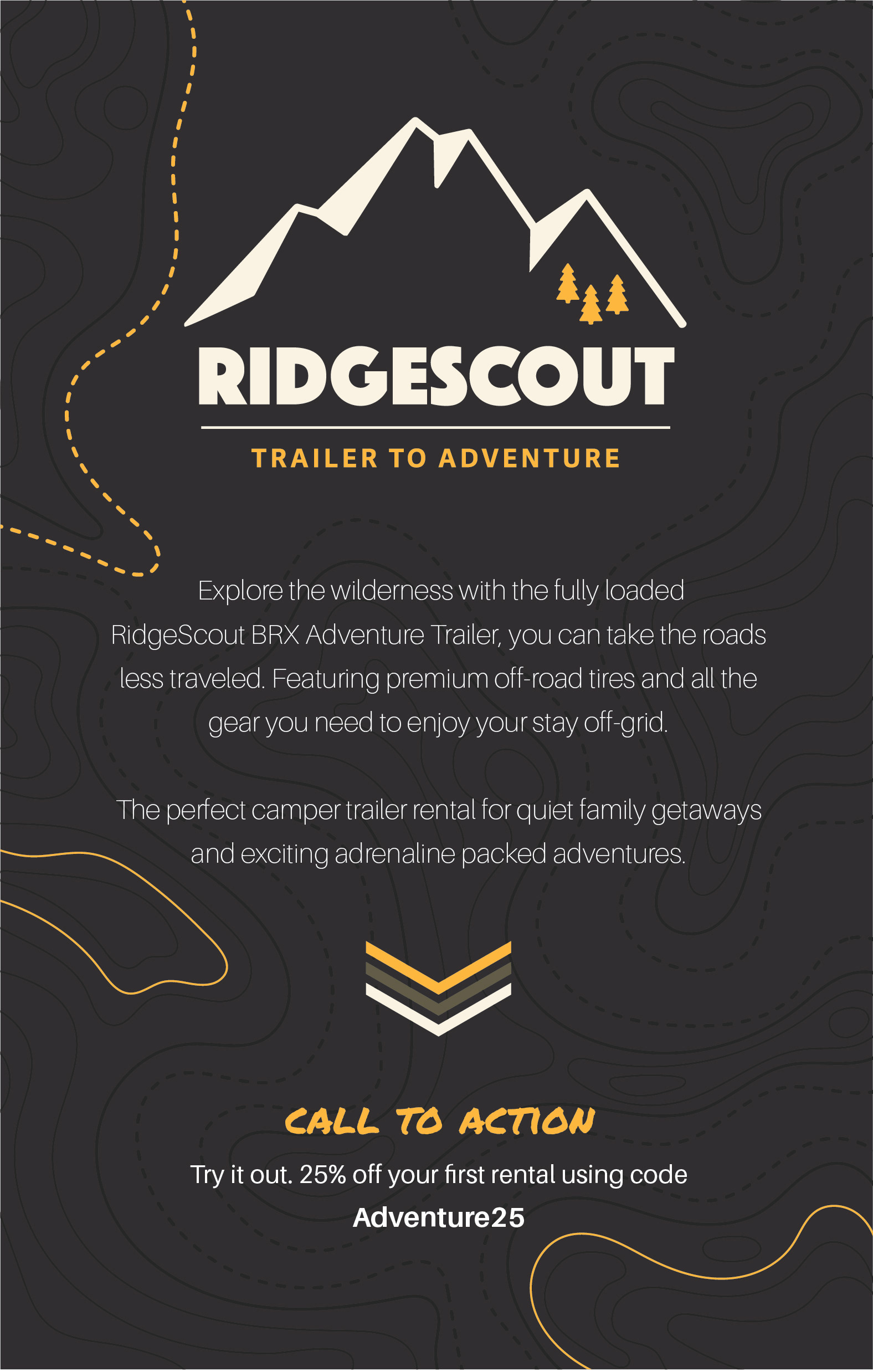
At the heart of Ridgescout's ethos lies their commitment to fostering a culture of outdoor exploration and family togetherness. Their brand identity, symbolized by three golden trees was inspired by the owner's own children and their innate desire to explore the natural world. These trees stand as a beacon of encouragement, inviting families to embark on memorable adventures and forge lasting connections amidst the great outdoors.